Besides the design, loading time and performance, accessibility determines the user experience of the web apps that you're building profoundly. This quick guide will give you an introduction to the why and how of testing your website's user experience using screen readers.
What Is a Screen Reader Exactly?
A screen reader is a form of assistive technology that is oftentimes used by blind, visually impaired website visitors as well as those who have a learning disability or who are illiterate. Screen readers can at times be essential for users to be able to navigate the web and to discover relevant content on websites which is consumed to a large part visually by sighted users.
Even though there is a range of different modi of screen readers used by your website's audience, the most popular types of device is the text-to-speech screen reader which this article is focussing on.
Why You Should Know How a Screen Reader Works If You Are Sighted
With a near perfect (either corrected or not) vision, you might never feel the need to use a screen reader when browsing the internet. So obviously, there's no need for you to understand how screen readers work or how to use one, is there?
As a person who develops sites and applications on the web, it might already be second nature to you to make sure that the websites that you're building work as expected for your users. Checking that a web app runs fine for different user flows or that its design looks as expected across a range of browsers is crucial and might already be part of your daily routine at work when delivering a feature. Now imagine how difficult it would be to deliver a bug fix for a misaligned navigation bar on a site without having a single glance at your screen. The visual check turns out to be important to confirm that your fix for this styling bug addresses the issue, is functional and works fine in different browsers.
Thinking about bugs that concern accessibility, is there any valid reason why a functional check would not be needed to address issues and provide valid bug fixes? Manually testing the accessibility of the websites you're building is insightful and can be the most valuable confirmation that the patches you deliver to improve its usability actually work just as expected.
To be able to manually test websites for accessibility concerns, getting familiar with the basics of screen readers is essential to understand how users of assistive technology experience your site.
Where to Find a Screen Reader
Today there are plenty of text-to-speech screen readers available, which differ in the way they evaluate web pages. If you want to learn more about how a screen reader works under the hood and which implications this has on different behaviours of screen reader and browser combinations, you should read this excellent blog post by accessibility platform engineer Marco Zehe.
If you're looking for a free screen reader to get started, you can check out Voice Over (Mac OSX), NVDA (Windows) or Orca (Linux).
Getting Familiar with the Screen Reader of Your Choice
Since shortcuts between screen readers and operating systems differ, it is necessary to familiarise yourself with some of the most important shortcuts to navigate websites by reading their documentation.
What you'd like to know more about are the controls for jumping between
- interactive controls (e.g. hyperlinks or form elements)
- headings
- lists
- tables
- graphics
and how to activate form controls or links. Being comfortable with utilising this set of controls you should already be ready to navigate and explore web pages using the keyboard and a screen reader in tandem.
In the following, we'll take a closer look at some useful commands for using VoiceOver. Even though VoiceOver is used as a primary screen reader by only 11.7% of respondents of WEBAIM's Screen Reader User Survey in 2017, this screen reader is just like NVDA entirely free and will make it easy for you to get started with screen reader driven testing when you're on an OSX machine.
Navigation Basics for Using VoiceOver
In case you're working with VoiceOver you can memorise a set of short cuts to get started with navigating web pages or alternatively, you can also use a more visual interface to switch between navigation of different kinds of elements smoothly.
Useful VoiceOver Short Cuts for Site Navigation
The vast majority of short cuts in VoiceOver are a combination of the Control + Option key combo and another key. Navigate forwards (jump to the next element) using these key combinations:
- navigation between interactive controls:
Tab - navigation between headings:
Control+Option+H - navigation between lists:
Control+Option+X - navigation between tables:
Control+Option+T - navigation between graphics:
Control+Option+G
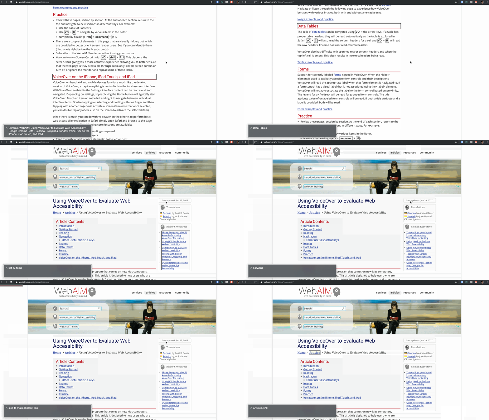
When on a website, you can navigate between elements in their hierarchical order as indicated through the HTML markup using Control + Option + the left / right arrow keys.
Use the Shift key in addition to the controls mentioned above to jump back to the previous element of the same kind. Finally, if you're ever getting stuck inside a particular part of the site, use Control + Option + Shift + the up and down arrow keys to navigate between different levels of content (e.g. to jump from a paragraph back to the parent main element).
Quick Access to Navigation Elements Using the VoiceOver Rotor
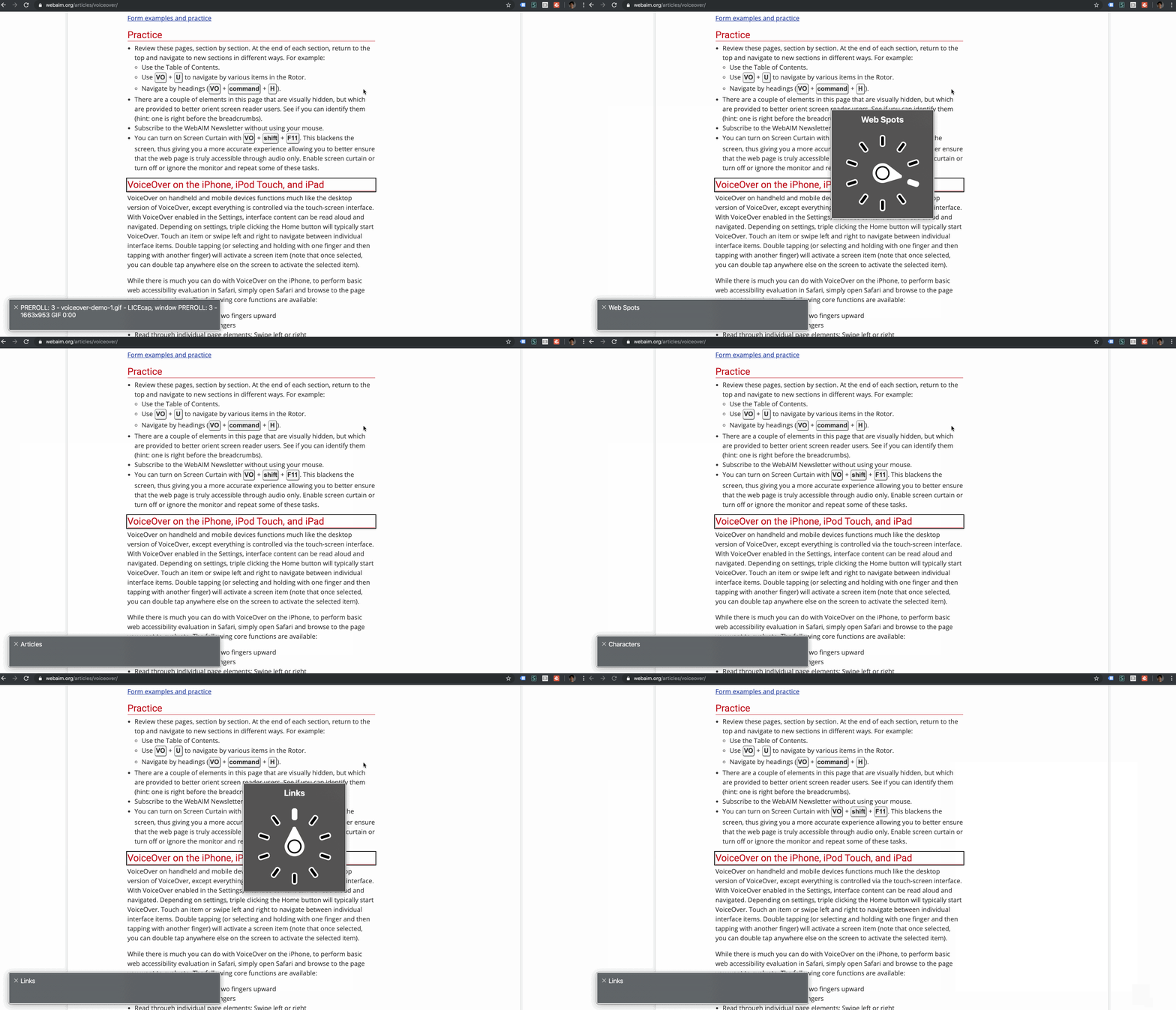
The VoiceOver rotor feature provides a way to skim through different types of navigation elements quickly. Especially for sighted users the graphic user interface of this util comes into handy to have an overview of the navigation options when you do not have a cheat sheet at hand.
To use it, press Control + Option + Command and navigate in between the different categories using the left and right arrow keys:

Once a category has been selected, flip through all elements of that respective category using the up and down arrow keys in combination with Control + Option + Command:

Testing Websites Authentically
Testing websites using a screen reader will be a powerful method for asserting that the websites you're building are accessible to everyone. Once you feel more familiar with keyboard controls and your screen readers' short cuts, I highly recommend to test your websites as close to the UX of your site's users as possible: with the screen shut off.
Try Testing Without Visual Feedback
While you're testing your website without any visual feedback, find out for yourself how easy or hard it is to find your page's main navigation. How easy is it to skim through your site's headings? Do you find it straightforward to navigate to the following page?
Try Testing With Different Screen Readers
According to the latest WEBAIM Screen Reader User Survey, your website's user base will be using different screen readers when visiting your website, with JAWS and NVDA being the most common ones. If you haven't done so already, be sure to give testing with these often-used screen readers a shot if applicable for your machine's operating system and find out for yourself, if your website is stable and working as expected across different screen reader & browser combinations.
Get Started with Screen Reader-Driven User Testing Today
I hope this quick guide to using screen readers for sighted developers has been helpful for you to understand the importance of screen reader-driven user testing and how it will help you to create a better understanding for the accessibility of the applications you're building.
Questions? Suggestions? Send me an e-mail or ping me on Twitter ✨
Sources
- A special thank you goes to @LeonieWatson for reviewing this blog post and providing insightful feedback on screen reader usage statistics. You can follow her work on her blog or on Twitter ✨
- WEBAIM: Using VoiceOver to Evaluate Web Accessibility
- Marco Zehe: Why Accessibility APIs Matter
- Daniel Mclaughlan on Twitter: Screen reader driven page navigation across document levels
- WEBAIM: Screen Reader User Survey 2017 - Results
